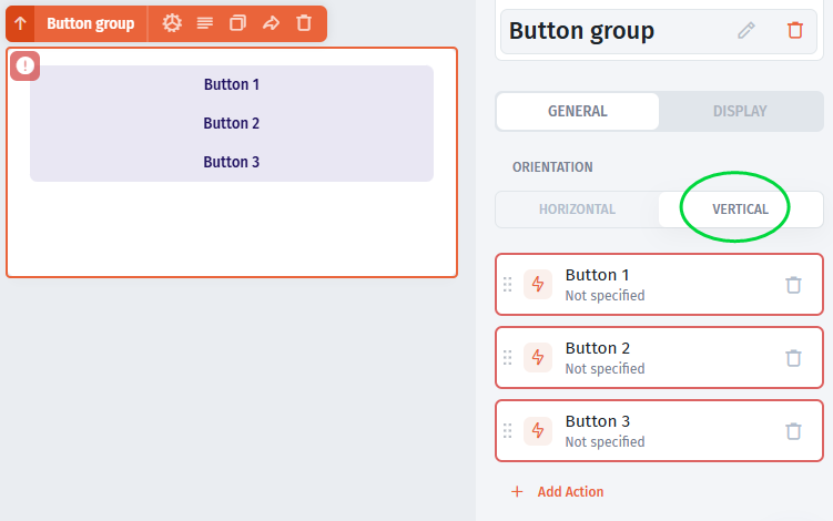
# Button Group
The Button Group component is simply easing the process of aligning and organizing a group of buttons' layout vertically or horizontally. Each button has it's own actions, and nothing functionally ties it up with other buttons except the layout.
### Button Group's Orientation
In the Button group's properties, you can set the buttons' layout horizontally or vertically depending on the design you need.
### Button Group's Actions
There are no actions for the Button Group container. It functions as just a container. however you can add [actions ](https://docs.jetadmin.io/user-guide/design-and-structure/actions)to each button inside it separately. For example, you can add actions such as Run Operations, Export Data, Open an overlay, Copy to clipboard, Send an email, Run a workflow, Navigate to a page and others.


